
If you don’t mind riding on high-stress roads, you can go anywhere on your bike. But for those who aren’t willing to use roads with high traffic stress, it may be that you just can’t get from here to there. When high-traffic-stress roads are excluded, the remaining network of low-stress bikeways can be fragmented, making connectivity a critical issue that drives both user choice and public investment.
Visual Representations of Connectivity
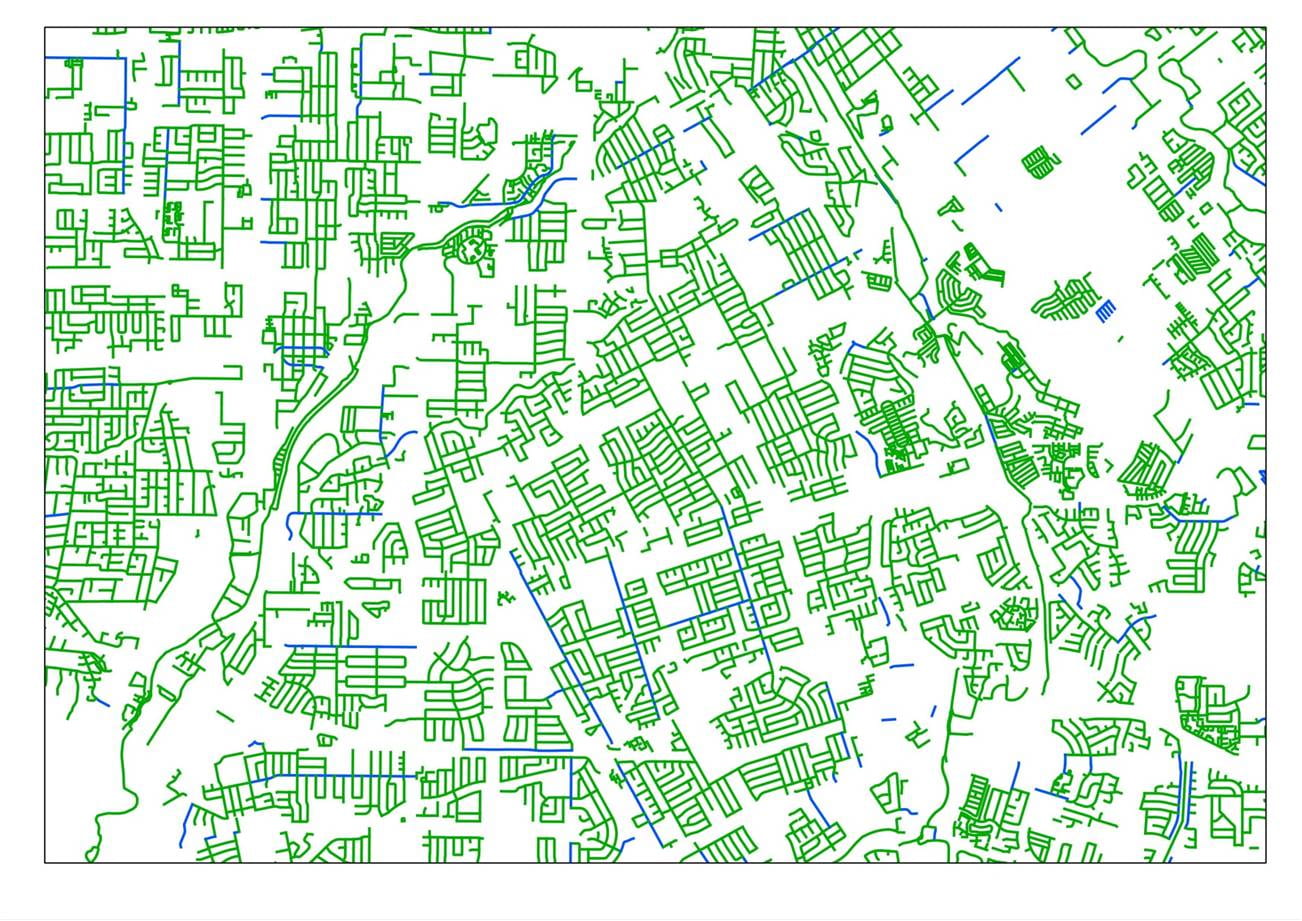
The image below shows a part of San Jose circa 2011 with its streets classified by level of traffic stress (LTS). Paths and streets with lowest stress level, LTS 1, are green; LTS 2 is blue; LTS 3 is purple; and LTS 4, the highest stress level, is tan. If you’re part of the two or three percent of people willing to ride on even the highest stress roads, this is your bike network.

Network with links classified by LTS (LTS1 = green; LTS2 = blue; LTS3 = purple; LTS 4 = tan)
Now let’s erase all the streets with LTS 4. If you’re part of the next 7 percent or so of the population that can tolerate level of traffic stress 3, this is your bike network. Already, some serious gaps appear.

Showing only links with LTS 3 or less
Now let’s erase the streets with LTS 3, leaving only the streets and paths with LTS 1 or 2. This is the bike network that the mainstream population, roughly 90 percent of adults, is willing to use. The gaps and disconnectedness are obvious.
Showing only links with LTS 2 or less
Finally, let’s erase all except LTS 1 links, leaving only the links suitable for children to ride. Most of the road network is still there, because more than 60% of it is local, residential streets. But those streets aren’t connected – and that’s not coincidence, it’s by design, in order to keep through traffic off of neighborhood streets. As a result, you see a lot of small islands of connected links, isolated from each other like ice floes in the Arctic Ocean. With a network like this, children could leave home on their bike, take short tour of their neighborhood, and then come back home – not much more.

Showing only links with LTS = 1
Another way to visualize the disconnectedness of the low-stress bicycling network is to identify and map all the disparate islands. Below are maps showing “stress islands” for LTS 1 and for LTS 2. (To limit clutter, only the larger islands are shown in color.)

Stress islands for LTS 1 (only the larger islands are shown). Freeways are shown in black for orientation.
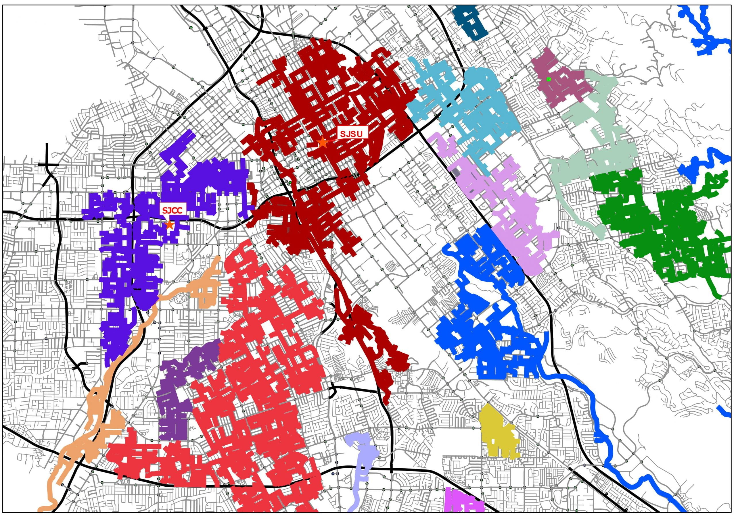
Stress islands for LTS 2 (only the larger islands are shown)
Naturally, the stress islands for LTS 2 are larger than the LTS 1 islands. But even so, most of them are too small to make low-stress bicycling a practical option for getting places. If you live in one of these islands, your job would have to be in the same island for you be able to enjoy a low-stress bike route to work.
At many points, different islands appear to touch one another. At those points, the high-stress gap separating the islands is very narrow. The gap could be nothing more than a wide road that lacks a safe crossing, or a single, short high-stress block that. That suggests an obvious investment strategy: improve a select set of short links to creates “bridge” between islands. This strategy makes the most of the existing set of low-stress links with limited investment.
Here’s a slate of suggested improvements, shown in heavy red. Most of them are short links as just described. And a few are long lines – because in corridors where the only connecting right-of-way is a busy road, the only way to create a low-stress through route is to create a safe bikeway all along that road, say, by building a cycle track.
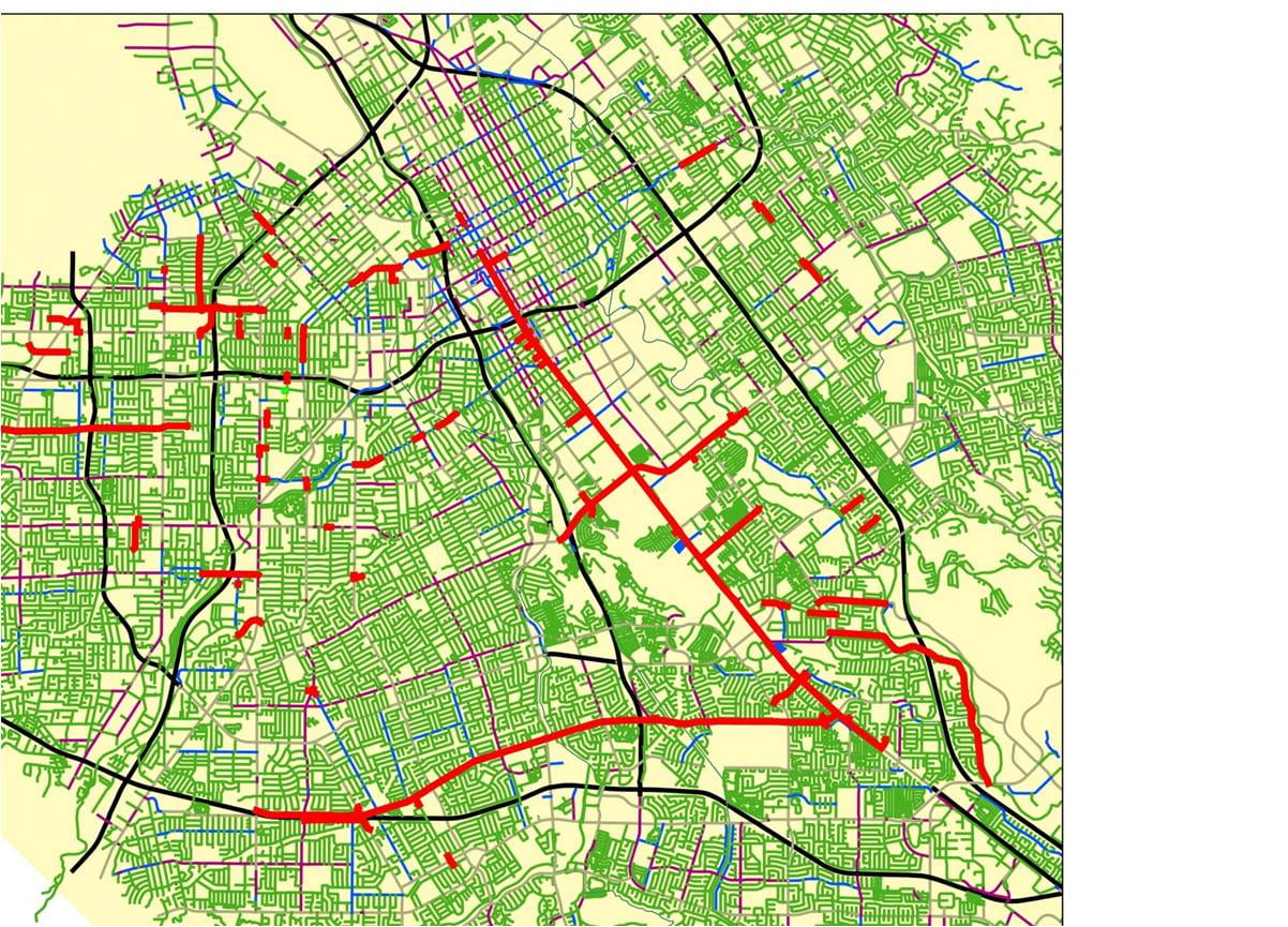
Suggested slate of improvements – links that form bridges between stress islands
Below is the stress island map that would result if those improvements were made. There is now one large island covering quite a bit of territory. (However, many streets — those not colored purple — still remain unconnected, showing the need for additional improvements.)
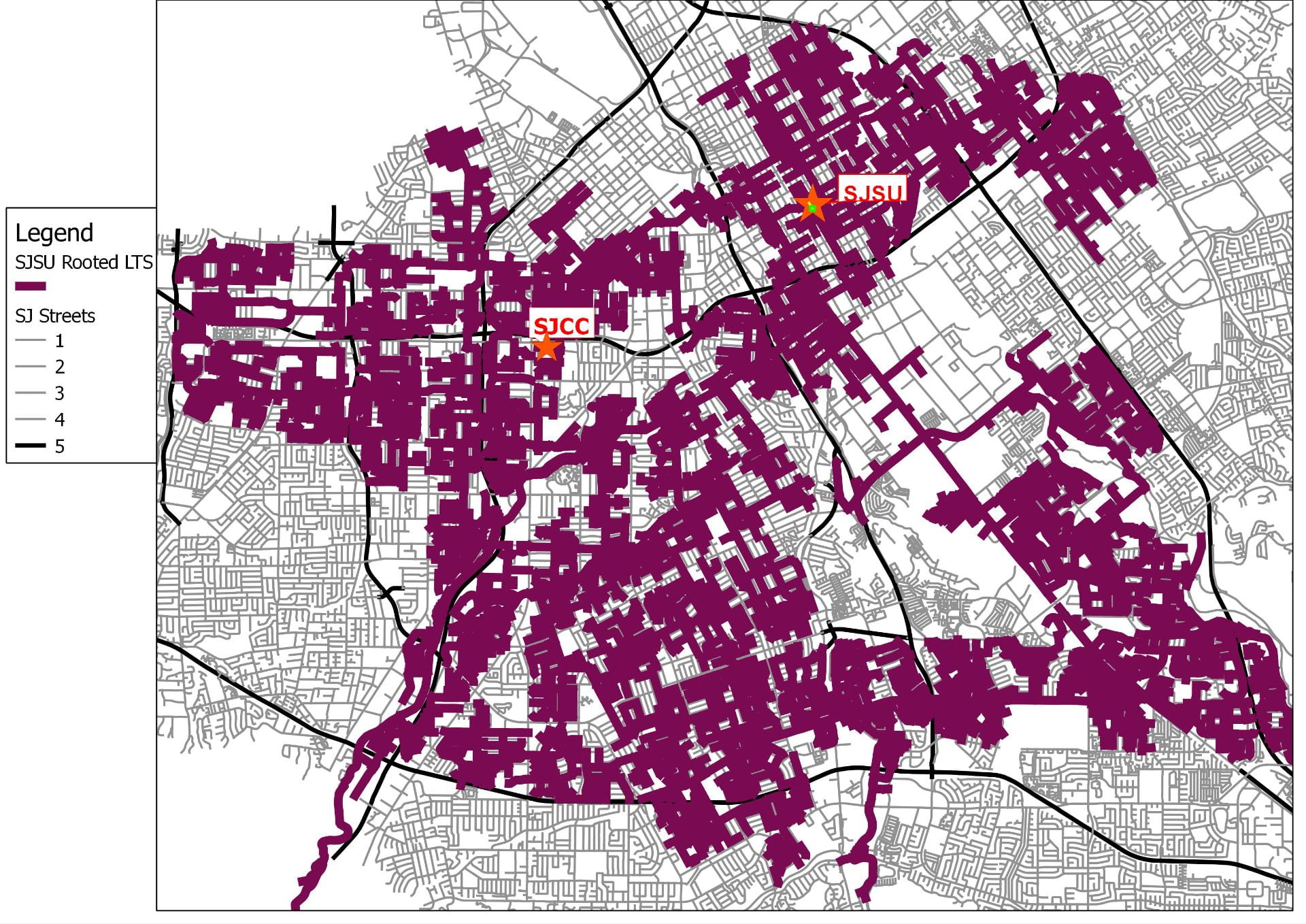
A large LTS2 stress island that would result from making the suggested improvements
A Limit for Acceptable Detour
Going back to the set of links with LTS 1, consider points A and B: are they connected? By taking a really roundabout route, it actually is possible to get from A to B following only low-stress links. But few people are willing to follow a route involving that much detour; they are more likely to try to consider only the more direct but higher stress route, and reject it (and therefore reject bicycling as an option for this trip) if they don’t want to use high stress routes.
INSERT IMAGE HERE
While everybody has a different limit for how long a detour they’d be willing to make, a practical limit for network planning uses these criteria:
For short trips (no more than 0.75 miles via the most direct route), the low-stress route should not be more than 0.33 miles longer than the most direct route
For longer trips, the low-stress route should not be more than 25% longer than the most direct high-stress route.
A pair of points is considered “connected” at a specified level of traffic stress only if there is a path between the two points using only links that do not exceed that level of traffic stress and that does not exceed the acceptable level of detour.
A Measure of Connectivity
For a given set of origins and destinations, a measure of connectivity for a specified level of traffic stress is
the fraction of origin-destination (O-D) pairs that are connected without exceeding the specified level of traffic stress and without exceeding the allowed level of detour.
This measure can be applied with different sets of origins and destinations and with distance limitations. Origins are usually homes; destinations could be jobs, shopping centers, schools, regional recreation areas, or other homes, from example. To analyze the potential for bicycling as a mode of travel for work trips in San Jose, we used jobs as destinations, specified level of traffic stress to be 2, and limited the analysis to trips that, via the most direct path, are between 0.5 and 6.0 miles. We found that with the existing network, only 4.7% of home-work pairs in the city are connected, while if the proposed slate of improvements were implemented, that fraction would rise to 12.7%.
We used the same concept to analyze metro Boston’s network of greenways. The existing network has 89 miles of greenway, including 7 greenways of substantial length – but, remarkably, they are all disconnected from one another. Because of that, the fraction of home-work pairs that are connected by greenways — allowing for 1 km of travel to access a greenway at both the home and work end — is only 0.7 percent.

Existing greenways in metro Boston: 89 miles of greenway, yet less than 1% of home-work pairs are connected by greenways
Below is a map of the potential greenway network Boston could have, including new rail-trails, new paths along historic parkways, and some new parkways that could be built within the right-of-way of roads that are far wider than they need to be to carry their traffic.

Potential greenway network: 230 miles of greenway, and 47% of home-work pairs are connected by greenways
This potential network includes links connecting the existing greenways as well as extensions and new greenways; altogether its length is 230 miles, or about 2.5 times the length of today’s network. But in terms of connectivity, the difference is astronomical. The fraction of home-work pairs that are connected by a greenway rises from 0.7 percent to 47 percent, and the fraction of home-home pairs connected by a greenway rises from xxx percent to xxx percent.
For further elaboration, see
- seminal report by Mekuria, Furth, and Nixon published by the Mineta Transportation Institute
- article in Atlantic Cities
- Peter Furth’s TEDx talk, Creating Successful Bicycling Networks in Boston